What is a Histogram
Histograms are a topic that we could (and probably should) spend a lot of time talking about but let me give you a very brief answer to get you through in the short term.
Histograms are a very useful tool that many cameras offer their users to help them get a quick summary of the tonal range present in any given image.
It graphs the tones in your image from black (on the left) to white (on the right).
The higher the graph at any given point the more pixels of that tone that are present in an image.
So a histogram with lots of dark pixels will be skewed to the left and one with lots of lighter tones will be skewed to the right.
The beauty of a histogram is that the small LCD display on your camera is not really big enough to give you an great review of a picture and you can often get home to find that you’ve over or under exposed an image. Checking the histogram can tell you this while you’re in a position to be able to adjust your settings and take another shot.
Some Examples of Histograms
Let’s look at a couple of examples of histograms on shots:
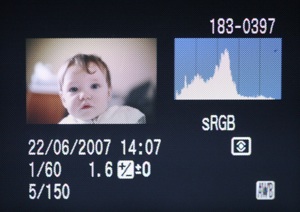
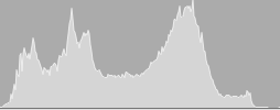
Compare these two shots and their corresponding histograms:


The above shot has a lot of light tones - in fact there are parts of the shot that are quite blown out. As a result on the right hand side of the histogram you can see a sudden rise. While there are quite a few mid tones - everything is skewed right and with the extreme values on the right hand side indicate an over exposed shot.


This second shot has a lot of dark tones. This is partly because of the black and navy clothes in the shot - but also because it’s slightly underexposed shot. The resulting histogram is quite different to the first one - the values are skewed to the left hand side.
Is there such a thing as a ‘good’ histogram?
As with most aspects of photography, beauty is the in eye of the beholder and there’s always a lot of room for personal taste and different ways of expressing yourself as a photographer.
There is no such thing as the ‘perfect’ histogram - different subjects and photographic styles will produce different results. For example taking a silhouette shot might produce a histogram with peaks at both ends of the spectrum and nothing much in the middle of the graph. Taking a shot of someone at the snow will obviously have a histogram with significant peaks on the right hand side…. etc
Having said this (and to generalize) - in most cases you’ll probably want a fairly balanced shot with a nice spread of tones. Most well exposed shots tend to peak somewhere in the middle and taper off towards the edges.
Using Histograms While Shooting
So now you know what a histogram is - grab your digital camera’s manual and work out how to switch it on in playback mode. This will enable you to see both the picture and the histogram when reviewing shots after taking them.
Keep an eye out for histograms with dramatic spikes to the extreme ends of either side of the spectrum. This indicates that you have a lot of pixels that are either pure black or pure white. While this might be what you’re after remember that those sections of the image probably have very little detail - this is a hint that your image could be either over or under exposed.
The histogram is really just a tool to give you more information about an image and to help you get the effect that you want. Having your camera set to show you histograms during the view process will tell you how your image is exposed. Learning to read them will help you to work out whether you’re exposing a shot as you had hoped.
Another Example of a Histogram
Lets finish this tutorial by looking at one last example of a histogram:
You can see in this shot a much more even spread of tones. It’s still not perfect and I’d do a little post production work but it’s a much more evenly exposed shot and the histogram reflects this.
The whole tutorial and illustrations has been copied from here.
1 comment:
Anantha - I appreciate the link - but unfortunately we don't allow full articles to be republished. You're welcome to use an excerpt or quote (a paragraph or two) but not the full article. Could you please amend this?
The problem is that it gets both my site and yours in trouble with Google to have what they call 'Duplicate Content'.
Could you please change both this post and the others you've used from Digital photograph School.
Post a Comment